Elegant Logo and Packaging for Herbal Beauty Products – Case Study
Crafting a Natural, Elevated Brand Identity for a Botanical Beauty Line
When founder Amy Swei’s husband approached me about branding and packaging for her new line of herbal beauty supplements and serums, she wanted designs that felt clean, and high-end and spoke to the products’ botanical origins.
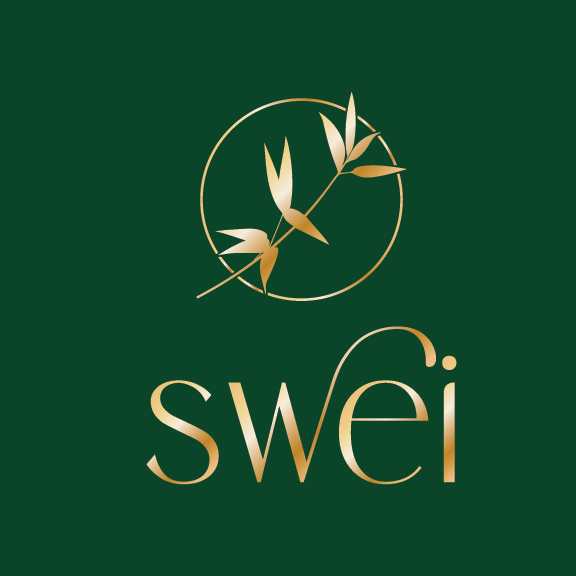
After learning about the traditional Eastern herbs used in the formulas and Amy’s background, I was inspired to incorporate natural symbols like bamboo into the branding.
For the logo, I designed a minimal, modern wordmark incorporating bamboo leaves that felt fresh yet sophisticated. Neutral gold and silver colorways established premium quality.
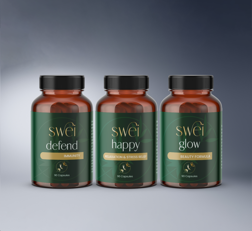

I carried this sleek, organic look into the supplement and serum labels and boxes using textured papers, real bamboo accents, and an earthy color palette.
The resulting packaging suite felt cohesive, reflecting swei’s commitment to natural wellness solutions. Julie was thrilled with how the brand identity and unboxing experience turned out.
The custom touches like bamboo and bold colors worked seamlessly to communicate the safety and efficacy of swei’s herbal offerings. It was so fulfilling to help bring Amy’s passion project to life through intentional design.

Project Overview:
- Created the logo design for “Swei,” a beauty product brand specializing in herbal supplements and serums.
Objective:
- The objective was to design a visually appealing and culturally relevant logo that represents the Asian heritage of the product developer while reflecting the brand’s focus on herbal beauty products.
Logo Concept:
- Incorporated the bamboo motif in the logo to symbolize strength, resilience, and natural beauty.
- Utilized a gold color palette for the supplements logo and a silver color palette for the serums logo to convey a sense of luxury and elegance.
Typography:
- Selected a clean and elegant font for the brand name “Swei,” ensuring readability and sophistication.
Cultural Representation:
- Ensured the logo design acknowledges the Asian heritage of the product developer, making it culturally relevant and meaningful.
Color Psychology:
- Employed gold and silver as primary colors to evoke feelings of prestige, quality, and premium nature of the beauty products.
Result:
- The “Swei” logo design effectively captures the brand’s essence, presenting a sophisticated and culturally relevant visual identity for the beauty product line
“Swei” Beauty Product Packaging Case Study
Project Overview:
- Developed the packaging design for “Swei” herbal supplements and serums, incorporating the logo and brand identity.
Objective:
- The objective was to create packaging that communicates the brand’s premium and herbal-focused beauty products.
Packaging Design:
- Designed the herbal supplements packaging with a rich dark green label, featuring the gold “Swei” logo and bamboo motif to reflect the product’s natural herbal ingredients.
- Created the serums packaging with a rich dark blue background, showcasing the silver “Swei” logo and bamboo motif to convey a sense of luxury and effectiveness.
Color and Material Selection:
- Chose dark green and dark blue colors to represent the natural essence of the herbal supplements and the effectiveness of the serums, respectively.
- Used high-quality materials to enhance the premium feel of the packaging.
Logo Integration:
- Seamlessly integrated the “Swei” logo and bamboo motif into the packaging design, ensuring brand consistency and visual appeal.
Unboxing Experience:
- Considered the unboxing experience, arranging the logo and branding elements to create an impactful first impression for customers.
Product Information and Labeling:
- Provided clear and concise product information and labeling on the packaging, complying with regulatory requirements and consumer expectations.
Result:
- The “Swei” beauty product packaging successfully conveys the brand’s premium and herbal-focused identity, enhancing the overall customer experience and attracting target audiences.