Boho Branding for a Sister-Owned Boutique – Case Study
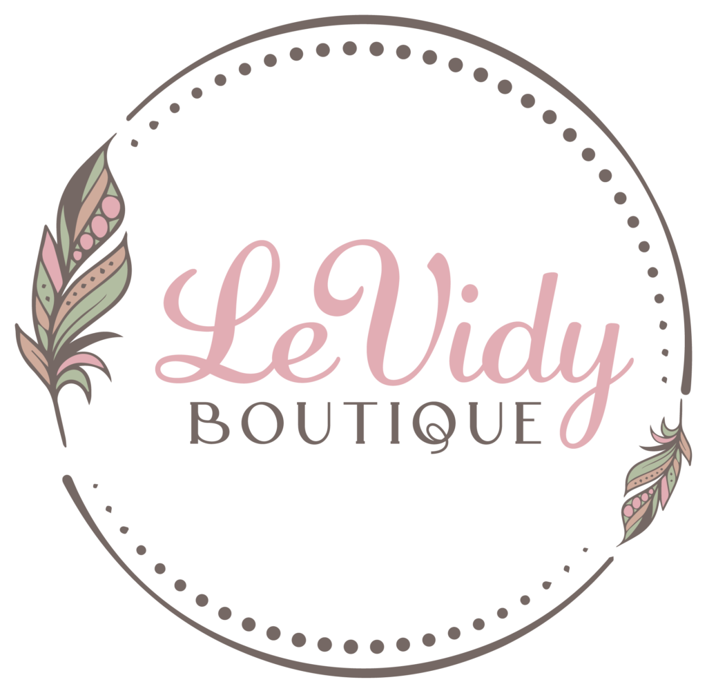
When the three sisters who own Levidy Boutique approached me about rebranding their clothing shop, we started by discussing their vision. They wanted a boho vibe to reflect their light, airy styles and free-spirited target audience.
After learning about their story and ethos of empowering women, I explored different logo options that would feel feminine, energetic, and fun. I played with script fonts and floral motifs to align with their brand character.
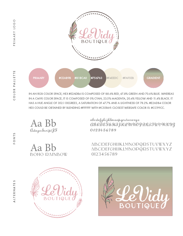
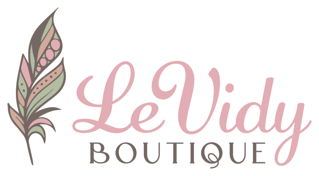
Ultimately, we landed on a logo with curling font that felt personal yet elegant. I wove in abstract floral shapes and a color palette of soft pinks, peaches, and mint green. These rosy, relaxed shades felt warm and welcoming.
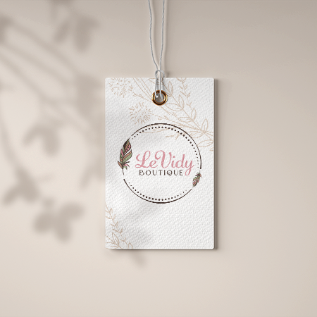
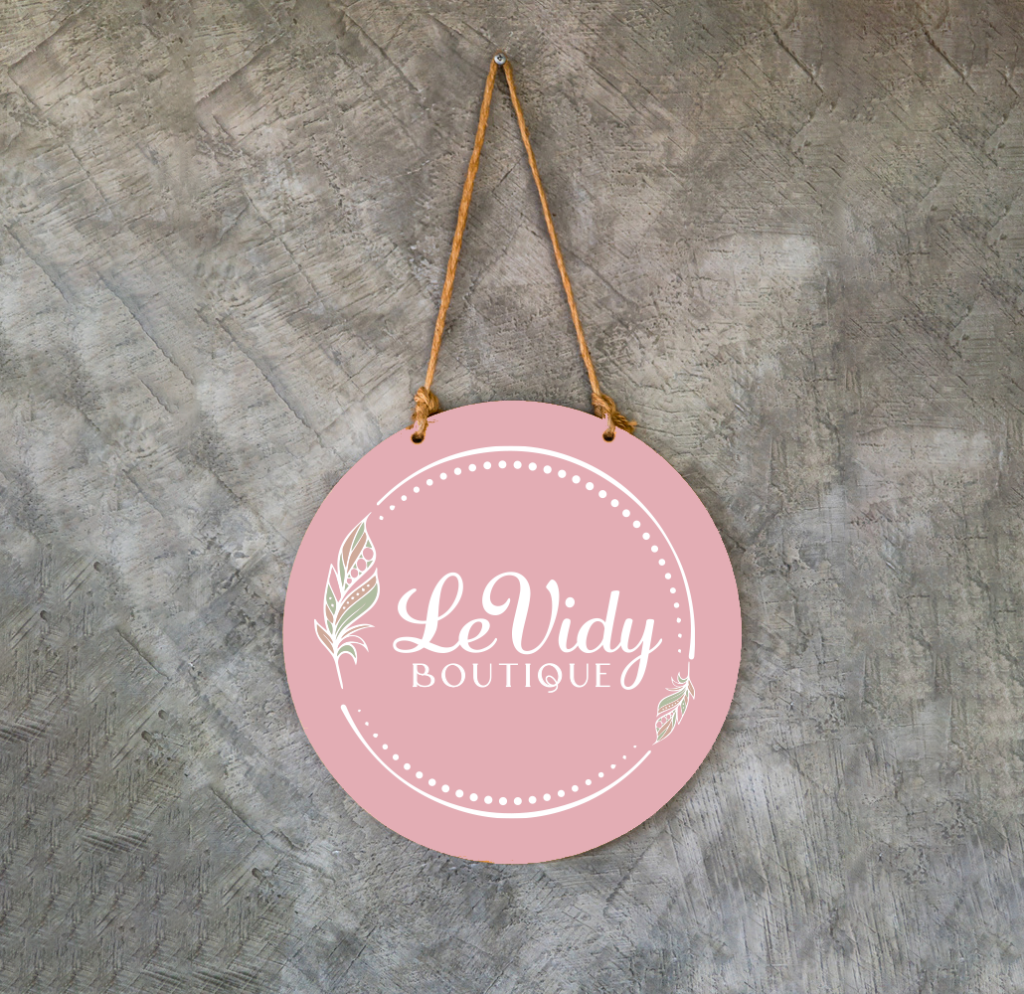
For collateral like tags and packaging, I designed complementary patterns and graphics. The boho textures and touches reinforced the boutique’s laidback, earthy aesthetic.
The end result was a cohesive brand identity and logo design they absolutely loved. It beautifully reflected the energy of their three distinctive personalities while feeling sophisticated.
This project exemplified the power of thoughtful branding. Levidy Boutique was thrilled with their refreshed, spirited look. And I was overjoyed to help these inspiring women share their passion through design.
Project Overview:
- Developed a distinctive brand identity and logo for Levidy Boutique, a clothing boutique run by three sisters, focusing on a boho style aesthetic.
Client Background:
- Introduced Levidy Boutique and its unique identity as a clothing store curated by three sisters, emphasizing their vision for boho-inspired fashion.
Branding Concept:
- Explained the branding concept, highlighting the boho style that resonates with the boutique’s offerings and the personal touch of three sisters’ collaboration.
Design Considerations:
- Discussed the design considerations taken into account, including the incorporation of rosey color tones, shades of mint, and taupes to capture the desired boho feel.
Logo Design Process:
- Outlined the logo design process, from initial concepts to the final chosen design that embodies Levidy Boutique’s unique blend of style and sisterly collaboration.
Typography and Imagery:
- Showcased the font choice and visual elements that contribute to the boho and feminine ambiance of the brand.
Color Palette:
- Presented the color palette, focusing on the rosey hue along with shades of mint and taupes, creating a cohesive and inviting brand identity.
Brand Application:
- Illustrated how the brand identity was applied across various materials, such as business cards, tags, and online platforms.
Collaboration with Sisters:
- Emphasized the collaborative process with the three sisters, showcasing how their input and preferences were integrated into the final brand identity.
Result and Impact:
- Measured the impact of the new branding on Levidy Boutique’s image, customer perception, and market presence.
- Presented any feedback from the sisters about how the new brand identity resonates with their vision.